
Filters
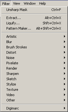 There still remains one action menu that we have not yet used, and that
is the Filter menu (left). There are far too many filters for me to
describe every single one in detail. Instead, I will discuss the main
menu items and some of the more useful sub-menu items and demonstrate
ways to use them to obtain often surprising results. I will also show
how filters can be used in combination to make your image really
sparkle.
The very top item on the menu with the keyboard shortcut Ctrl + F is
simply a repetition of the last filter that you used. It will change
every time you use a different filter. This is a convenient function
because sometimes the same filter must be applied multiple times in
succession to attain the desired result.
There still remains one action menu that we have not yet used, and that
is the Filter menu (left). There are far too many filters for me to
describe every single one in detail. Instead, I will discuss the main
menu items and some of the more useful sub-menu items and demonstrate
ways to use them to obtain often surprising results. I will also show
how filters can be used in combination to make your image really
sparkle.
The very top item on the menu with the keyboard shortcut Ctrl + F is
simply a repetition of the last filter that you used. It will change
every time you use a different filter. This is a convenient function
because sometimes the same filter must be applied multiple times in
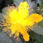
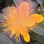
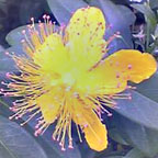
succession to attain the desired result.Extract is a function that helps you extract an object from the background. It is similar to the Lasso, except that it provides far more precision. It is generally used when the outline of an object is difficult to trace by hand, particularly in cases of animals or people with stray hairs flying about.
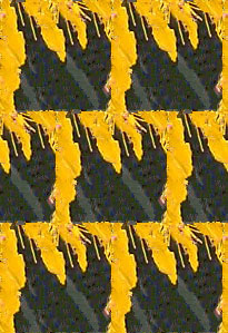
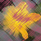
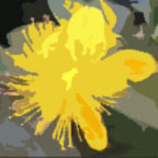
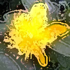
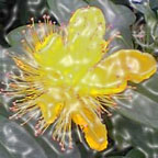
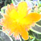
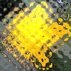
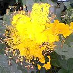
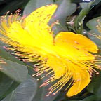
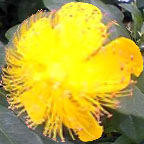
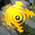
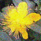
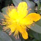
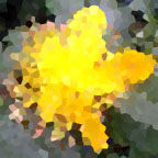
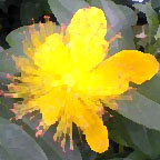
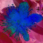
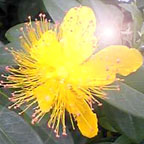
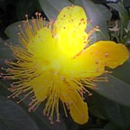
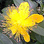
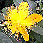
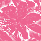
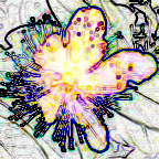
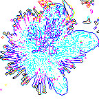
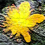
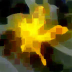
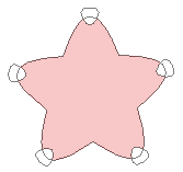
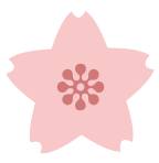
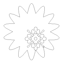
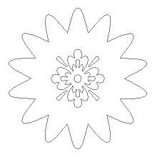
Open the image from which you wish to extract an object and activate the Extract filter. As an example, I have chosen a flower with a lot of hairlike projections (below). Use the highlighter to highlight the edges of the object to be extracted. The key is to use a relatively thin line on clear edges and a thick line on edges that are more difficult to discern.
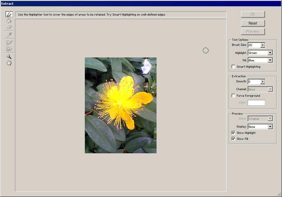
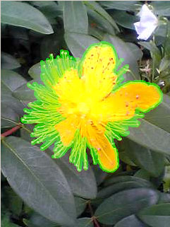
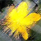
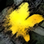
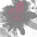
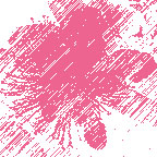
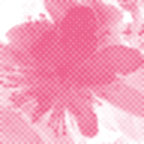
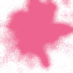
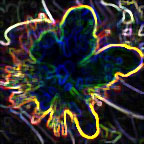
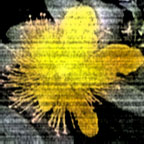
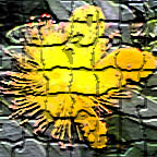
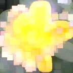
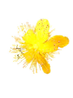 When you've finished highlighting the edge, the image should look
something like the picture on the left. Use the paint bucket Fill icon
and click on the inside of the highlighted area to show which part you
want to keep and then perform the extraction. (You can also fine-tune
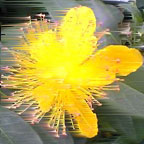
first using the Preview function.) The resulting extracted flower should
look like the picture on the right.
If you find you're having a hard time extracting an image with the other selection tools, you might want to give Extract a try.
When you've finished highlighting the edge, the image should look
something like the picture on the left. Use the paint bucket Fill icon
and click on the inside of the highlighted area to show which part you
want to keep and then perform the extraction. (You can also fine-tune
first using the Preview function.) The resulting extracted flower should
look like the picture on the right.
If you find you're having a hard time extracting an image with the other selection tools, you might want to give Extract a try.The next item on the menu, Liquify, allows you to warp the image. The Liquify workspace looks similar to the Extract workspace, but it has a set of tools for twisting, rippling, expanding, contracting, and making other such changes to the image. These tools smear the colors as if the image were made of wet paint.
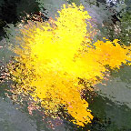
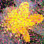
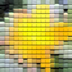
The Pattern Maker item takes a rectangular selection and samples the pixels in it to create a tile that can then be repeated as a pattern. This pattern can be saved to use later as a texture, or you can use it as an image, such as for the background of a web page.

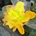
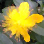
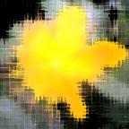
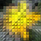
 For example, a clipping from the yellow flower picture (left) could be
converted into a repeating pattern similar to the one shown (right). If
you are not happy with the first pattern generated, you can keep
generating more random patterns until you get to one that suits your
needs.
For example, a clipping from the yellow flower picture (left) could be
converted into a repeating pattern similar to the one shown (right). If
you are not happy with the first pattern generated, you can keep
generating more random patterns until you get to one that suits your
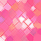
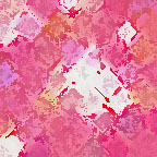
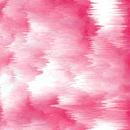
needs.For the rest of the filters, nothing beats experimentation to familiarize yourself with what they can do. Many of them use the foreground and background colors for their effects. I generated these examples with a white foreground and a pink background. Each filter has its own dialogue box with settings that can drastically change the result, so play around with the values while watching the preview to see what happens.
Artistic
This sub-menu allows you to simulate the effect of using artistic equipment and media such as colored pencils, pastels, and watercolors. Some examples of the effects are shown below. For most, the artistic effect is obvious...but plastic wrap? Surprisingly, this filter is useful for giving objects in your image a watery, glassy, or even metallic shine. It can also be used to give objects a "gummy" appearance that's great for logos.
 Colored Pencil |
 Cutout |
 Dry Brush |
 Plastic Wrap |
 Rough Pastels |
 Sponge |
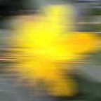
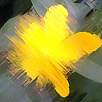
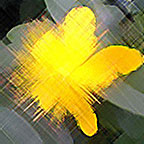
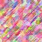
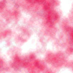
The Blur sub-menu does exactly what it says--it blurs your image. The three most important items on the menu are Gaussian Blur, which allows you to specify how many pixels to blur, Motion Blur, which causes "speed lines," and Radial Blur, which either swirls the picture in a circle (below) or makes lines radiating outward from a point. Gaussian Blur is invaluable for softening items in your image, especially when painting highlights and shadows by hand or adding a soft glow. Motion Blur and Radial Blur can be useful in combination with other filters to make patterns and textures.
 Gaussian Blur |
 Motion Blur |
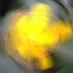 Radial Blur |
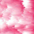
This is very similar to the Artistic sub-menu. Some of the possible results are shown below.
 Accented Edges |
 Angled Strokes |
 Crosshatch |
 Spatter |
 Sprayed Strokes |
 Sumi-e |
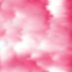
The Distort sub-menu warps and disrupts the image in a number of different, often extreme ways. Some important examples are shown below. Shear, in particular, is helpful when you want to warp an object to fit a specific curve, such as when you add a logo or pattern to something you want to appear three-dimensional.
 Diffuse Glow |
 Glass |
 Ocean Ripple |
 Shear |
 Spherize |
 zigzag |
The Noise sub-menu is used especially when repairing photographs. It helps to make small blemishes less noticeable. It can also add noise, which is convenient when combining filters to make patterns. The items of the Noise sub-menu are illustrated below.
 Add Noise |
 Despeckle |
 Dust & Scratches |
 Median |
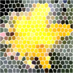
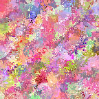
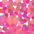
The items on the Pixelate sub-menu distort the colors of the image by grouping areas of nearby pixels together into large blocks or dividing portions of the image into various shapes and sizes. Examples of this are shown below.
 Crystallize |
 Facet |
 Fragment |
 Mezzotint |
 Mosaic |
 Pointillize |
This sub-menu allows sophisticated three-dimensional manipulation and lighting effects. The cloud filters, in particular, are extremely convenient when combining filters to make patterns. Samples of this sub-menu's functions are illustrated below.
3D Transform |
 Clouds |
 Difference Clouds |
 Lens Flare |
 Lighting Effects |
This is another sub-menu often used for photo repair. It emphasizes the outlines of objects as determined by sharp differences in color or intensity. The items of the sub-menu are demonstrated below.
 Sharpen |
 Sharpen Edges |
 Sharpen More |
 Unsharp Mask |
This is another sub-menu designed to simulate artistic drawing techniques and media. Most of the items in the sub-menu rely heavily on the foreground and background colors. Some examples are shown below.
 Conté Crayon |
 Graphic Pen |
 Halftone Pattern |
 Photocopy |
 Torn Edges |
 Water Paper |
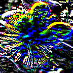
This sub-menu distorts the image colors in extreme ways. It is very useful when designing patterns and logos. Samples of this sub-menu are illustrated below.
 Diffuse |
 Extrude |
 Find Edges |
 Glowing Edges |
 Trace Contour |
 Wind |
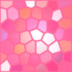
As the name suggests, this sub-menu applies a three-dimensional or other texture to the image, as shown below. If used creatively, these items can incredibly enhance your work.
 Craquelure |
 Grain |
 Mosaic Tiles |
 Patchwork |
 Stained Glass |
 Texturizer |
The items in this sub-menu apply to video and not still images.
Other
This sub-menu allows various other functions (below). In particular, the Custom item lets you input values to design your own filter.
 Custom |
 High Pass |
 Maximum |
 Minimum |
 Offset |
This allows you to embed or read an electronic "watermark" to signal that the image is your copyrighted property.
The filters themselves can provide amazing results, but the real power lies in combining them to create new and unique effects. Below are some suggestions for ways that you can combine filters.
Color from Nothing
The Add Noise filter has the property of introducing color where there wasn't any before. You can follow this with other filters to exaggerate the colors that are created, as shown below. The filters in this example are applied sequentially, but you could stop at any point in the sequence if you like the effect. Fill (Reddish Gray) |
 Add Noise (20%) |
 Pointillize (Size: 15) |
 Dry Brush (10, 5, 1) |
 Rough Pastels (10, 5, Sandstone) |
 Spatter (10, 5) |
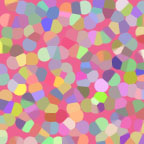
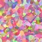
From Circles to Squares
You can use the filters to change the shapes that make up the image, from dots to polygons to squares. For the example below, I inverted the foreground and background colors. Depending on your needs, you can use various filters to create perfect circles, stripes, clean squares, and a number of whorled and mottled patterns. In particular, the Pixelate filter Color Halftone and the Sketch filter Halftone Pattern give polka dots, checks, and stripes that can be then be modified further into textile-like designs, among other patterns. Fill (Dark Pink) |
 Pointillize (Size: 20) |
 Gaussian Blur (2px) |
 Stained Glass (10, 5, 3) |
 Crosshatch (20, 10, 2) |
 Sponge (0, 5, 1) |
If at First You Don't Succeed
Sometimes applying the same filter more than once is the way to achieve the result you desire. In this example, I'm trying to simulate clouds at sunset...but Clouds by itself really doesn't do the trick. Thus I added and repeated other filters until it looked the way I wanted it. The sequence of filters is demonstrated below. Other filters that benefit from repetition are Difference Clouds and Find Edges. Clouds |
 Unsharp Mask (250%, 25px, 0) |
 Unsharp Mask (250%, 25px, 0) |
 Wind (Stagger, Right) |
 Wind (Stagger, Right) |
 Gaussian Blur (2px) |
Saving patterns, brushes, and alpha channels
Up until now, I have frequently mentioned "if you like, you can create and save your own" in regard to such things as patterns and brushes. I did not, however, explain how to do so. Well, now's the time to rectify that!
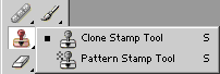 First, take a look at the Clone Stamp tool on the toolbar (left). The
Clone Stamp tool is similar to the Healing Brush tool...in fact, it is
the forerunner of the Healing Brush tool, since it was used in earlier
versions of Photoshop before the Healing Brush was introduced. With the
Clone Stamp, as with the Healing Brush, you first select an area of the
image as the source. When you start painting, your brush copies whatever
was drawn in the spot that you designated as the source. This allows
you to paint over blemishes and other obstructions.
First, take a look at the Clone Stamp tool on the toolbar (left). The
Clone Stamp tool is similar to the Healing Brush tool...in fact, it is
the forerunner of the Healing Brush tool, since it was used in earlier
versions of Photoshop before the Healing Brush was introduced. With the
Clone Stamp, as with the Healing Brush, you first select an area of the
image as the source. When you start painting, your brush copies whatever
was drawn in the spot that you designated as the source. This allows
you to paint over blemishes and other obstructions.The important thing to note with the Clone Stamp tool is that it has an item called "Aligned" in its menu bar. If you check "Aligned," then the spot designated as the source from which the copy is drawn will move along with your cursor, no matter how many times you click. Unchecking "Aligned" means that every time you let go of the mouse button and click again while drawing, the source point reverts back to its original position.
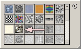 Now click on the other option, the Pattern Stamp tool. This tool doesn't
use part of the image as its source. Instead, it draws from the menu of
saved patterns (right). You can select a pattern with the pull-down
menu in the menu bar. Many patterns come with the software, but it's
possible to create your own. The pink arrow indicates an image of cherry
blossoms from a photograph that I defined as a pattern.
Now click on the other option, the Pattern Stamp tool. This tool doesn't
use part of the image as its source. Instead, it draws from the menu of
saved patterns (right). You can select a pattern with the pull-down
menu in the menu bar. Many patterns come with the software, but it's
possible to create your own. The pink arrow indicates an image of cherry
blossoms from a photograph that I defined as a pattern.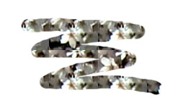 Open a new file and choose a pattern. I will use the cherry blossom
pattern for this example. With "Aligned" checked, draw on the image. If
you draw over the entire image, it will give the same effect as if you
had used Fill to fill the image with the pattern. If the pattern is
smaller than your image, it will tile repeatedly to fill the available
space. No matter how many times you click as you draw, once you have
drawn on a part of the image, the picture does not change. My example is
shown in the picture (left).
Open a new file and choose a pattern. I will use the cherry blossom
pattern for this example. With "Aligned" checked, draw on the image. If
you draw over the entire image, it will give the same effect as if you
had used Fill to fill the image with the pattern. If the pattern is
smaller than your image, it will tile repeatedly to fill the available
space. No matter how many times you click as you draw, once you have
drawn on a part of the image, the picture does not change. My example is
shown in the picture (left).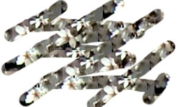 Now uncheck "Aligned" and try drawing again. This time, if you release
the mouse button and click again, the pattern starts up from a different
point. If you draw over a previously drawn area this way, the image
changes. My example is on the right.
Now uncheck "Aligned" and try drawing again. This time, if you release
the mouse button and click again, the pattern starts up from a different
point. If you draw over a previously drawn area this way, the image
changes. My example is on the right.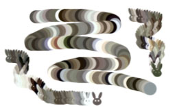 Finally, check the "Impressionist" option in the menu bar. Try drawing
and see what happens. This time your brush doesn't leave a plain
pattern, it leaves a trail of multicolored dots in the shape of the
brush. Changing the brush leaves a differently shaped trail. In my
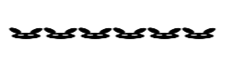
example, I used a circular brush and a custom bunny-shaped brush (left).
Finally, check the "Impressionist" option in the menu bar. Try drawing
and see what happens. This time your brush doesn't leave a plain
pattern, it leaves a trail of multicolored dots in the shape of the
brush. Changing the brush leaves a differently shaped trail. In my
example, I used a circular brush and a custom bunny-shaped brush (left).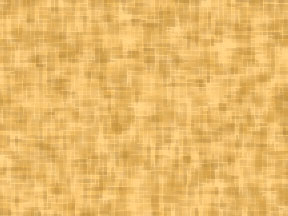 The question is, how do you save patterns to the pattern menu? First you
have to create the pattern. You can use a part of a photograph, like
the cherry blossom pattern, though that doesn't make a very good pattern
tile because it has sharply defined edges where the pattern repeats.
You may have to extract the object in the photo from its background
first, or at least blend the edges so that they run smoothly together.
You can also use the Pattern Maker filter to turn a section of an image
into a pattern tile, as demonstrated in Lesson 10. A third option is to
use filters to make a pattern you like, such as the woven-look pattern
created in Lesson 11 (right).
The question is, how do you save patterns to the pattern menu? First you
have to create the pattern. You can use a part of a photograph, like
the cherry blossom pattern, though that doesn't make a very good pattern
tile because it has sharply defined edges where the pattern repeats.
You may have to extract the object in the photo from its background
first, or at least blend the edges so that they run smoothly together.
You can also use the Pattern Maker filter to turn a section of an image
into a pattern tile, as demonstrated in Lesson 10. A third option is to
use filters to make a pattern you like, such as the woven-look pattern
created in Lesson 11 (right).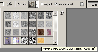 Once you have the pattern, use the Rectangular Marquee to select the
area you want to be a single tile. Then go to Edit → Define Pattern and
type in a name for your new pattern. That's it! The pattern you saved
now appears on the pattern menu (left). You can use it with the Pattern
Stamp tool, as well as with the Paint Bucket/Fill function, Layer Style,
and any other time a pattern is an option. You can delete items from
the pattern menu at any time if you no longer need them.
Once you have the pattern, use the Rectangular Marquee to select the
area you want to be a single tile. Then go to Edit → Define Pattern and
type in a name for your new pattern. That's it! The pattern you saved
now appears on the pattern menu (left). You can use it with the Pattern
Stamp tool, as well as with the Paint Bucket/Fill function, Layer Style,
and any other time a pattern is an option. You can delete items from
the pattern menu at any time if you no longer need them.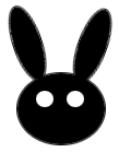 Now that you know how to define a pattern, the next step is to define
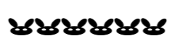
your own custom brushes, such as the bunny used above. To the right is
the original drawing from which that brush was made. Decide what kind of
image you want for your brush and draw it in simple black and white.
(If you try to use color, it will still only be saved as a grayscale
image.) You don't have to be an artist to draw a new brush. This bunny
was done using only the Elliptical Marquee tool; it has three black
ellipses for the face and ears and two white circles for the eyes.
Now that you know how to define a pattern, the next step is to define
your own custom brushes, such as the bunny used above. To the right is
the original drawing from which that brush was made. Decide what kind of
image you want for your brush and draw it in simple black and white.
(If you try to use color, it will still only be saved as a grayscale
image.) You don't have to be an artist to draw a new brush. This bunny
was done using only the Elliptical Marquee tool; it has three black
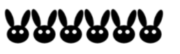
ellipses for the face and ears and two white circles for the eyes.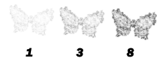 Drawing a crisp black and white image like this bunny gives you a crisp
brush. Drawing an image with grayscale shading gives you a grayscale
brush. One problem that you run into with a grayscale or grainy brush is
that it can sometimes appear very faint and require multiple clicks to
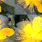
be visible. The numbers under the butterflies (left) indicate how many
clicks it took to get that intensity. You could also use the airbrush
function and hold the mouse button down until the brush has laid down
enough paint. Grayscale brushes such as this are useless with the Pencil
tool, because the pencil only draws sharp outlines with no
anti-aliasing.
Drawing a crisp black and white image like this bunny gives you a crisp
brush. Drawing an image with grayscale shading gives you a grayscale
brush. One problem that you run into with a grayscale or grainy brush is
that it can sometimes appear very faint and require multiple clicks to
be visible. The numbers under the butterflies (left) indicate how many
clicks it took to get that intensity. You could also use the airbrush
function and hold the mouse button down until the brush has laid down
enough paint. Grayscale brushes such as this are useless with the Pencil
tool, because the pencil only draws sharp outlines with no
anti-aliasing.Once you have your desired brush image, select it with the Marquee and click Edit → Define Brush, then give your new brush a name, exactly as you did when defining a new pattern. The new brush will appear in the Brush menu. You can use it with all tools that make use of the Brush menu, such as the Eraser, Blur, the History Brush, the Healing Brush, and so on.
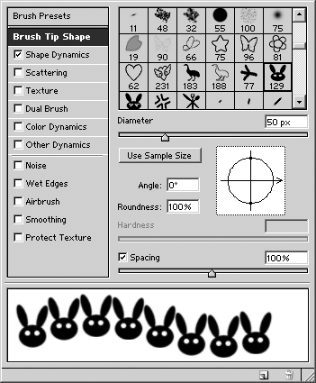 There are extra brush tricks that you can add to your new brush using
the Brush palette (right). The first item on the menu lets you select
the brush from the menu. Here I've chosen the bunny.
There are extra brush tricks that you can add to your new brush using
the Brush palette (right). The first item on the menu lets you select
the brush from the menu. Here I've chosen the bunny."Angle" sets what angle the brush is tilted. "Roundness" allows you to squash the brush shape. "Spacing" sets how far apart each iteration of the brush shape is painted. The pictures below illustrate these properties.
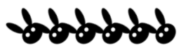 Angle: 45° |
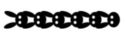 Angle: 90° |
 Roundness: 25% |
 Roundness: 50% |
 Spacing: 1% |
 Spacing: 100% |
The Shape Dynamics sub-menu allows you to control the size of the brush. "Size Jitter" makes the size of the brush change randomly as you draw. The pull-down menu beneath this item changes how this size change is applied. "None" means that you have no control, the computer applies the jitter randomly. "Fade" makes the size begin relatively large and then grow gradually smaller according to how many "steps" you input. These properties are illustrated below. The remaining options are only valid if you have a stylus and pad connected to your computer.
Shapes
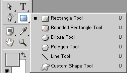 In addition to the Pen tool, there is one other tool capable of drawing
paths, and that is the Shape tool (left). Just as the Pen tool is like
the path equivalent of the Lasso, the Shape tool is like the path
equivalent of the Marquee...but with much more flexibility.
In addition to the Pen tool, there is one other tool capable of drawing
paths, and that is the Shape tool (left). Just as the Pen tool is like
the path equivalent of the Lasso, the Shape tool is like the path
equivalent of the Marquee...but with much more flexibility.
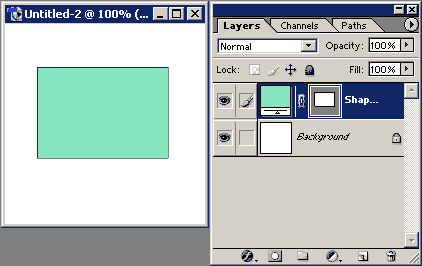 Open a new image and select the Rectangle tool. Use it to draw a
rectangle exactly as if using the Rectangular Marquee tool. When you
release the mouse button, the tool will automatically create a vector
mask in the shape of the rectangle you drew. This vector mask is linked
to a new fill layer that is automatically filled with the foreground
color, as you can see if you look at the Layers palette (right).
Open a new image and select the Rectangle tool. Use it to draw a
rectangle exactly as if using the Rectangular Marquee tool. When you
release the mouse button, the tool will automatically create a vector
mask in the shape of the rectangle you drew. This vector mask is linked
to a new fill layer that is automatically filled with the foreground
color, as you can see if you look at the Layers palette (right).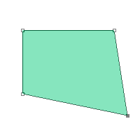 Like the paths drawn with the Pen tool, the paths drawn with the Shape
tool can also be manipulated with the Path tool. For example, you can
select and drag the anchor points with the Direct Selection tool to
alter the shape of the rectangle (left). Changing the path changes the
vector mask.
Like the paths drawn with the Pen tool, the paths drawn with the Shape
tool can also be manipulated with the Path tool. For example, you can
select and drag the anchor points with the Direct Selection tool to
alter the shape of the rectangle (left). Changing the path changes the
vector mask.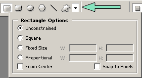 The menu bar for the Shape tool looks similar to the menu for the Pen
tool. The pull-down option menu, indicated by the arrow (right), changes
depending on the variant of the Pen or Shape tool you are using, but
its location on the menu bar is the same.
The menu bar for the Shape tool looks similar to the menu for the Pen
tool. The pull-down option menu, indicated by the arrow (right), changes
depending on the variant of the Pen or Shape tool you are using, but
its location on the menu bar is the same.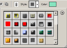 When you are using one of the path-drawing tools in "shape layer" mode,
the style pull-down menu will appear (left). This option automatically
sets the layer style for the fill layers that are created. The style
menu contains the same styles as the Styles palette, so it will include
any that you have saved.
When you are using one of the path-drawing tools in "shape layer" mode,
the style pull-down menu will appear (left). This option automatically
sets the layer style for the fill layers that are created. The style
menu contains the same styles as the Styles palette, so it will include
any that you have saved.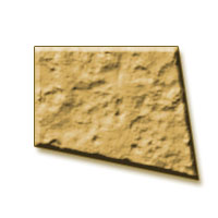 At the very bottom of the menu in this picture, you can see the "potato"
style thumbnail created in Lesson 8. Applying the "potato" style to the
current shape layer gives the result shown in the picture on the right.
This is one way you can use the Shape tool to create eye-catching logo
images.
At the very bottom of the menu in this picture, you can see the "potato"
style thumbnail created in Lesson 8. Applying the "potato" style to the
current shape layer gives the result shown in the picture on the right.
This is one way you can use the Shape tool to create eye-catching logo
images.The first three shapes--Rectangle, Rounded Rectangle, and Ellipse--are fairly straightforward. They act almost exactly like the Marquee tool. When you get to the Polygon tool, however, there are interesting differences.
 Choose the Polygon tool and set it for five sides. The picture (left)
shows the different kinds of shapes you can create by changing the
options in the pull-down menu. These examples were all done with an
indent factor of 50%; changing that value will alter the appearance of
the shapes even further.
Choose the Polygon tool and set it for five sides. The picture (left)
shows the different kinds of shapes you can create by changing the
options in the pull-down menu. These examples were all done with an
indent factor of 50%; changing that value will alter the appearance of
the shapes even further.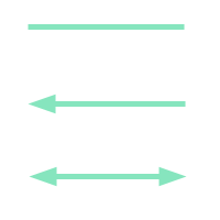 Next, select the Line tool. This allows you to draw straight, solid
lines. (Holding down the Shift key while dragging the mouse will keep
the lines perfectly straight in the eight major compass directions.) The
pull-down options let you add arrowheads of your specifications to one
or both ends of the line. The picture (right) shows some examples. These
arrows were done with values of 350% width, 500% height, and 0%
concavity.
Next, select the Line tool. This allows you to draw straight, solid
lines. (Holding down the Shift key while dragging the mouse will keep
the lines perfectly straight in the eight major compass directions.) The
pull-down options let you add arrowheads of your specifications to one
or both ends of the line. The picture (right) shows some examples. These
arrows were done with values of 350% width, 500% height, and 0%
concavity.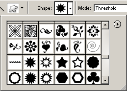 Finally, the Custom Shape tool allows you to draw a path with a
predetermined shape. The available shapes are listed in a pull-down menu
(left).
Finally, the Custom Shape tool allows you to draw a path with a
predetermined shape. The available shapes are listed in a pull-down menu
(left).As with the Brush menu, if none of the options on the menu suits your purposes, you can draw your own shape and add it to the menu. In order to do so, first you must create the path in the shape that you want. You can do this by drawing the shape directly with the Pen tool, either freehand or by tracing a background image.
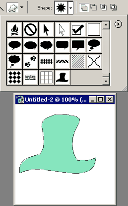 Another option is to make a path from a selection. This method is useful
if you want to select some portion of a background image to convert
into a custom shape. This also allows you to draw the desired shape
using the Brush. In this instance (right), I drew a picture of a floppy
top hat on its own new layer using a calligraphy brush. Then I used Load
Selection to select the hat and converted the selection into a path.
Another option is to make a path from a selection. This method is useful
if you want to select some portion of a background image to convert
into a custom shape. This also allows you to draw the desired shape
using the Brush. In this instance (right), I drew a picture of a floppy
top hat on its own new layer using a calligraphy brush. Then I used Load
Selection to select the hat and converted the selection into a path.Once you have the path in the shape you desire, right-click on it and choose "Define Custom Shape." This adds the shape you created to the menu for the Custom Shape tool.
 The fun part is when you start combining the properties of the Shape
tool. For example, you can make a cherry blossom. Choose pink as the
foreground and white as the background. Set the Polygon tool for five
sides with rounded corners, star, and 50% indent, and make one blossom.
Next, change the Polygon to three sides, uncheck star, and input a set
radius of 5mm. Select the subtraction mode icon from the menu bar and
place one triangle at the tip of each petal to leave notches as shown in
the picture (left). If you think you will ever want to make cherry
blossoms again, you can now right-click on it and save it to the Custom
Shape menu.
The fun part is when you start combining the properties of the Shape
tool. For example, you can make a cherry blossom. Choose pink as the
foreground and white as the background. Set the Polygon tool for five
sides with rounded corners, star, and 50% indent, and make one blossom.
Next, change the Polygon to three sides, uncheck star, and input a set
radius of 5mm. Select the subtraction mode icon from the menu bar and
place one triangle at the tip of each petal to leave notches as shown in
the picture (left). If you think you will ever want to make cherry
blossoms again, you can now right-click on it and save it to the Custom
Shape menu.To make the stamens in the middle, choose a darker pink for the foreground color. With the Custom Shape tool, select "floral ornament 4" from the pull-down menu and draw one shape in the center of the blossom. (If you're not satisfied with its appearance, you can draw your own stamen shape and save it to the menu instead.)
 At this point, your blossom should resemble the picture on the left. If
you don't like it being so flat, you can use Layer Style to emboss it,
stroke it, or add a shadow.
At this point, your blossom should resemble the picture on the left. If
you don't like it being so flat, you can use Layer Style to emboss it,
stroke it, or add a shadow.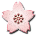 In this example (right), the stamen layer has a style of Drop Shadow
(color: red, opacity: 100%, distance: 2, size: 4), Outer Glow, and Inner
Bevel (smooth). The petal layer has a style of Drop Shadow, Emboss
(chisel hard, shadow opacity: 50%), Texture (watercolor), Gradient
Overlay (white to pink, radial), and Stroke (size: 3, gradient: pink to
white to dark pink, style: diamond, scale: 105%).
In this example (right), the stamen layer has a style of Drop Shadow
(color: red, opacity: 100%, distance: 2, size: 4), Outer Glow, and Inner
Bevel (smooth). The petal layer has a style of Drop Shadow, Emboss
(chisel hard, shadow opacity: 50%), Texture (watercolor), Gradient
Overlay (white to pink, radial), and Stroke (size: 3, gradient: pink to
white to dark pink, style: diamond, scale: 105%).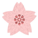 Another option is to rasterize each layer and apply filters. In this
picture (left), the petal layer received the combination Add Noise (5%,
uniform, monochromatic), Radial Blur (40, zoom), Unsharp Mask (250%,
3px), and Facet. The stamen layer received Craquelure (15, 5, 10). For
both layers, the filters were applied after using Load Selection to make
sure the parts did not lose their shape.
Another option is to rasterize each layer and apply filters. In this
picture (left), the petal layer received the combination Add Noise (5%,
uniform, monochromatic), Radial Blur (40, zoom), Unsharp Mask (250%,
3px), and Facet. The stamen layer received Craquelure (15, 5, 10). For
both layers, the filters were applied after using Load Selection to make
sure the parts did not lose their shape.You can, of course, combine styles and filters. Once the layers are rasterized, you can also draw on them with the Brush or other tools to make additional enhancements. It's entirely up to what image you have in mind.
Another thing you can do with the Shape tool is use it to make 3D shapes. The cylinder-like arrow buttons at the bottom of the page were made this way.
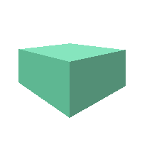
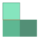 As an example, you can make a cube out of three squares. Open a new
image and create three squares with the Rectangle tool, making each
square a slightly different shade of the same color, as in the picture
on the right.
As an example, you can make a cube out of three squares. Open a new
image and create three squares with the Rectangle tool, making each
square a slightly different shade of the same color, as in the picture
on the right.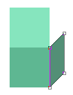 Next, use the Direct Selection tool to give the cube depth. Drag the
right side of the right-hand square path upward and to the left. It
should take on a "squashed" appearance as shown in the picture on the
left. When you are satisfied with the depth of the cube, use the Direct
Selection tool again on the top square so that its right side connects
with the right-hand square.
Next, use the Direct Selection tool to give the cube depth. Drag the
right side of the right-hand square path upward and to the left. It
should take on a "squashed" appearance as shown in the picture on the
left. When you are satisfied with the depth of the cube, use the Direct
Selection tool again on the top square so that its right side connects
with the right-hand square. It may take a bit of practice, but you should wind up with a cube like
the one in the picture on the right. By starting with rectangles rather
than squares, you can make 3D blocks in the shapes of buildings or other
objects in the same fashion.
It may take a bit of practice, but you should wind up with a cube like
the one in the picture on the right. By starting with rectangles rather
than squares, you can make 3D blocks in the shapes of buildings or other
objects in the same fashion.If you're familiar with the principles of perspective, you can use paths as guidelines for adjusting the sides of your shapes so that they angle toward the vanishing point(s). The nice thing about paths is that, even if you drag them beyond the edge of your canvas onto the blank work area, you can still see them. This means that your canvas doesn't have to be huge, as it would be if you used regular lines painted on a disposable layer. The general process is shown below.
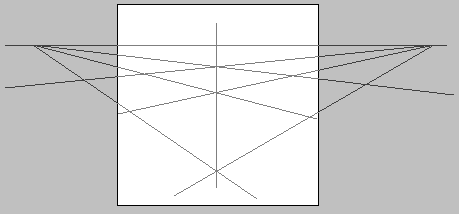 Step 1: Draw perspective guides |
 Step 2: Draw sides of shape |
 Step 3: Select and fill each side |
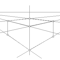
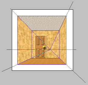 You can use the same principle with one-point perspective, as in the
picture on the right. The square paths for the walls were drawn with the
Rectangle tool. Once you have the outline of the object, such as this
room, you can paste texture layers over the perspective lines, then use
Edit → Transform → Scale and Edit → Transform → Skew to make the edges
of the pasted layers match up with the paths.
You can use the same principle with one-point perspective, as in the
picture on the right. The square paths for the walls were drawn with the
Rectangle tool. Once you have the outline of the object, such as this
room, you can paste texture layers over the perspective lines, then use
Edit → Transform → Scale and Edit → Transform → Skew to make the edges
of the pasted layers match up with the paths.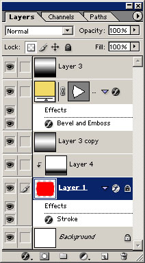 With curved shapes, such as spheres and cylinders, you will need to add
extra layers for highlights and shadows. You can draw the highlights and
shadows with the Brush or with the Gradient tool. Changing the blending
mode and opacity of each highlight/shadow layer allows you to fine-tune
the shape's appearance.
With curved shapes, such as spheres and cylinders, you will need to add
extra layers for highlights and shadows. You can draw the highlights and
shadows with the Brush or with the Gradient tool. Changing the blending
mode and opacity of each highlight/shadow layer allows you to fine-tune
the shape's appearance.As you can see from the Layers palette for the arrow button image (left), effective use of highlight/shadow layers can make your shapes jump out. "Layer 1" is the cylinder itself, composed of a square and two ellipses merged and then rasterized. (If this were a true cylinder, the ellipse on one side would be left separate and given its own different shade, like the top of the cube in the example above, but that made the button look much more as if it were pointing outward from the screen, so I eliminated that aspect.) Changing the fill color of this layer is what changes the arrow buttons from red to green to blue.
The yellow arrow was a simple triangle drawn with the Polygon tool. It was then altered by adding a smooth anchor point to one side with the Direct Selection tool and dragging that point to make the side curve.
"Layer 3" and "Layer 3 copy" are the highlights. "Layer 3" has a blending mode of Overlay and opacity of 60%, while "Layer 3 copy" was changed to make the blending mode Lighten. The highlight itself was originally drawn with the Gradient tool.
"Layer 4" is the shadow. It was also drawn with the Gradient tool. It has a blending mode of Darken and opacity of 50%.
Layer Style was then used on the shape layers to make them stand out even further.
Tips and tricks
You have finally arrived at the last lesson! That's not to say this is the end of Photoshop's capabilities. Far from it! It's just the end of my knowledge on the subject. This lesson is a collection of quick tips on things that weren't covered in previous lessons but that weren't large-scale enough to warrant lessons of their own.
1. Straightening images
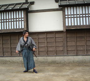
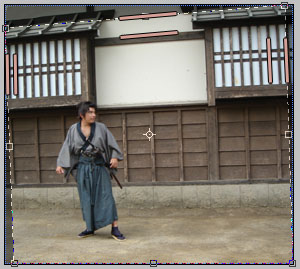
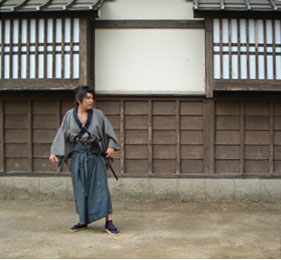
Sometimes you take a picture or scan a picture and notice that the contents are crooked. This could be because you held the camera tilted or placed the image on the scanner slightly tilted. It could also be that the objects themselves simply look crooked from the angle that the picture was taken, such as when you are trying to capture tall buildings.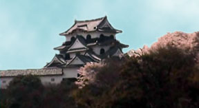
 In a situation such as in this picture of Hikone Castle during cherry
blossom season (left) where the objects in the image are tilted,
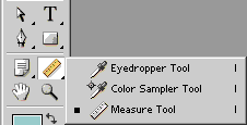
rotating the image will solve the problem. Select the Measure tool
(right). Use this tool to click and drag along a tilted line in the
image. It will automatically calculate the angle for you. Then go to
Image → Rotate Canvas → Arbitrary. The dialogue box will open with the
angle already input from the Measure tool. All you have to do is press
Enter or click OK and the picture will rotate to make the crooked line
straight. This leaves some white space around the picture, so you will
have to crop it to clean up the edges. This process is illustrated
below.
In a situation such as in this picture of Hikone Castle during cherry
blossom season (left) where the objects in the image are tilted,
rotating the image will solve the problem. Select the Measure tool
(right). Use this tool to click and drag along a tilted line in the
image. It will automatically calculate the angle for you. Then go to
Image → Rotate Canvas → Arbitrary. The dialogue box will open with the
angle already input from the Measure tool. All you have to do is press
Enter or click OK and the picture will rotate to make the crooked line
straight. This leaves some white space around the picture, so you will
have to crop it to clean up the edges. This process is illustrated
below.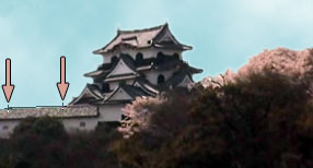 Measure |
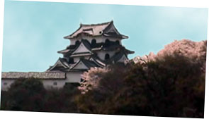 Rotate |
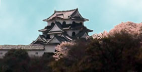 Crop |
 Before |
 During |
 After |
2. Using filters on masks
Step 1 |
Step 2 |
Step 3 |
Step 4 |
Step 1: Type the text of the logo. I used a font called Kelmscott. In this case, I wanted the masked layer to stand out, so I made the text and the background white. (Choosing different colors for the text can alter the way the logo turns out, especially if you also experiment with different blend modes.) Apply a Layer Style if desired. I used Drop Shadow and Emboss (smooth).
Step 2: Add a new gradient layer. (It could be a fill layer, or you could create your own texture or pattern in a new layer, whatever suits you.) I used a rainbow gradient set to Linear at -40°.
Step 3: Design the mask for the gradient layer. First, Alt + click on the mask and use Load Selection to mask everything except the area of the logo. Once that is done, deselect and apply filters to the mask. I used the Artistic filter Colored Pencil (5, 15, 0).
Step 4: Apply the mask to the gradient layer. Now the gradient only shows through in the pattern of the pencil strokes. If you don't like the way the color spills a little past the outline of the letters in places, you can clean it up by editing the mask with Load Selection again to paint black over any areas outside the actual text. In this case, I happened to like the somewhat sloppy/scratchy look, so I kept it as-is.
This same principle can be applied to create many different effects, so use your imagination to spice up your projects. By the same token, you can also use filters on alpha channels, or even the regular color channels.
3. Aligning objects
There are occasions when you want to align multiple objects, but this is very difficult to do accurately just by eyeing it. In such a situation, you can use Grid or Guides to help you, or you can use the align/distribution functions. Let's say I'm designing a menu, and I want to put a fork/knife/spoon graphic just inward from the four corners. If I were to place the graphics manually, they would probably wind up at slightly different distances from the sides of the image, no matter how hard I tried to line them up properly. This is where the Grid is convenient.In the View menu, you can set it to Show → Grid and Snap To → Grid. This makes a grid appear across your image. Whenever you move an object with the cursor under these settings, it will automatically snap to the nearest grid line. This way you can make certain that objects are aligned perfectly. The grid is only visible while you are editing the image, so you don't have to worry that it will show up after you save it. This grid can also be used to align text and selection areas as shown in the example below.
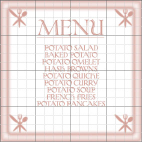 Grid Visible |
 Grid Invisible |
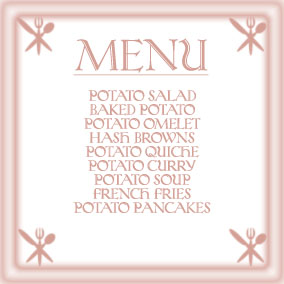
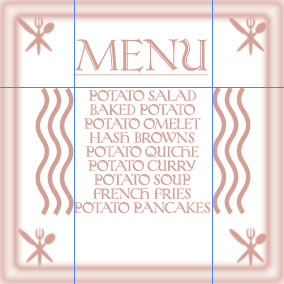 Guides Visible |
 Guides Invisible |
 Another way to align objects is to use the Align and Distribute
functions of the Move menu bar (right). Each item must be in its own
layer. In the Layers palette, click the box to the right of the eye icon
to make the "link" icon appear for every layer you want to align. If
you only link one layer to the active layer, only the Align menu will be
available. You must link two or more layers to the active layer for the
Distribute menu to become available.
Another way to align objects is to use the Align and Distribute
functions of the Move menu bar (right). Each item must be in its own
layer. In the Layers palette, click the box to the right of the eye icon
to make the "link" icon appear for every layer you want to align. If
you only link one layer to the active layer, only the Align menu will be
available. You must link two or more layers to the active layer for the
Distribute menu to become available.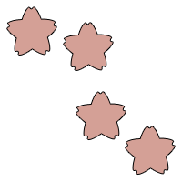 For this example, open a new image and use the Custom Shape tool to
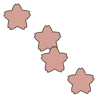
scatter some shapes randomly across it. I used the cherry blossom shape
created in Lesson 14 (left). Make sure you set the tool to create a new
layer for every shape.
For this example, open a new image and use the Custom Shape tool to
scatter some shapes randomly across it. I used the cherry blossom shape
created in Lesson 14 (left). Make sure you set the tool to create a new
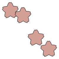
layer for every shape.Next, choose which shape you want to be the active layer and link the other shape layers to it. The layer you select to be the active layer is the one used as the reference point for the rest. If I choose the topmost cherry blossom as the active layer and click "Align top edges," the remaining three blossoms will all move upward until their top edges align with the top edge of the highest blossom. If the bottommost blossom is the active layer, on the other hand, clicking the same "Align top edges" icon will make the other three blossoms sink to the bottom of the image. This is illustrated below.
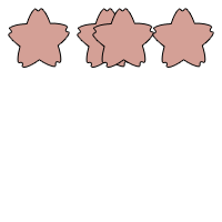 Align top edges (top blossom active) |
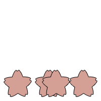 Align top edges (bottom blossom active) |
You can distribute the objects either horizontally or vertically...or both, if you use the function twice in a row. The pictures below show the result of using Distribute.
 Distribute top edges |
 Distribute left edges |
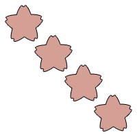 Distribute top edges + Distribute left edges |
 Polygon tool + Custom Shape tool |
 Align vertical centers + Align horizontal centers |
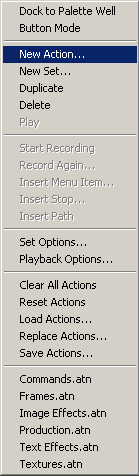
4. Using the Actions palette
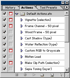 I have talked about many helpful palettes, but there is one in
particular I have not yet mentioned, and that is the Actions palette
(left). It is similar in function to the Styles palette. What it does is
keep a record of a sequence of actions, such as the application of
various filters, so that you can apply the exact same sequence later
with a single click.
I have talked about many helpful palettes, but there is one in
particular I have not yet mentioned, and that is the Actions palette
(left). It is similar in function to the Styles palette. What it does is
keep a record of a sequence of actions, such as the application of
various filters, so that you can apply the exact same sequence later
with a single click.
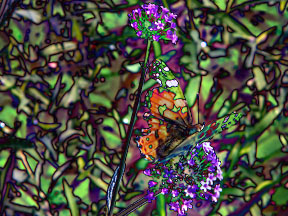
 To see how this works, open a picture. I will use this image of a butterfly (right).
Select one of the items on the Actions menu. If you click on the triangular arrow next to the title of the effect, you can see the specific sequence of actions that will be applied. Once you have the desired item highlighted, click the triangular "Play selection" icon at the very bottom of the palette. Below are some examples of preset items in the Actions palette.
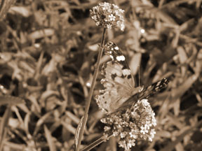 Sepia Toning |
 Oil Pastel |
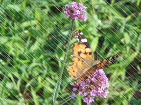 Light Rain |
 If you devise a sequence of actions that you want to be able to use
again later, you can save the sequence to the Actions palette. First
click the arrow in the upper right corner of the palette to bring up its
menu (left). Select "New Set" and give your set a name, such as "Custom
Actions" or "My Actions." (You can also do this by clicking the "Create
new set" icon at the bottom of the palette.)
If you devise a sequence of actions that you want to be able to use
again later, you can save the sequence to the Actions palette. First
click the arrow in the upper right corner of the palette to bring up its
menu (left). Select "New Set" and give your set a name, such as "Custom
Actions" or "My Actions." (You can also do this by clicking the "Create
new set" icon at the bottom of the palette.)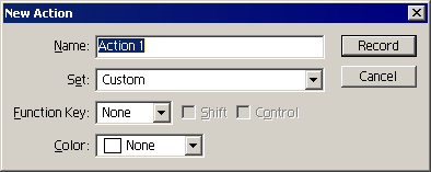 Once your new (empty) set has been saved to the palette, select your set
and choose "New Action" from the menu. This brings up a dialogue box
(right) that allows you to specify a function key for the action. If you
do this, then pressing the function key will perform the action.
Once your new (empty) set has been saved to the palette, select your set
and choose "New Action" from the menu. This brings up a dialogue box
(right) that allows you to specify a function key for the action. If you
do this, then pressing the function key will perform the action.You can also give your sequence a name to describe what it does. If your sequence can only be applied to a certain type of content, such as a selection area or a type layer, it's a good idea to specify this in the name.
Note that it is a good idea to begin your sequence by making a snapshot. That way, no matter how many steps there are in your sequence, you can always use the snapshot to undo back to the starting point if you don't like the effect.
Go through all of the steps in your sequence exactly the way you want them recorded. When you are finished, press the square "Stop playing/recording" icon at the bottom of the Actions palette.
Every step that you went through is saved, including all of the settings for any filters that you applied. If you have devised a sequence of filters that produces an effect you like, and you want to be able to reproduce the same effect exactly, the Actions palette is a great way to do so. One thing to watch out for is using filters, gradients, or other functions that depend on the foreground and background colors. You can still use them, you just have to make sure you include setting the foreground and background colors as part of the sequence.
Below is an example of an action that I created and named "Prismatic Glow."
 |
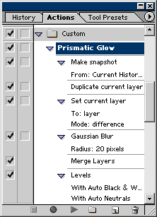 |
5. Making further adjustments
I've talked about how to use automatic functions such as Auto Color and more manual functions such as Brightness/Contrast to enhance images. There are many more functions available for making adjustments to the colors, brightness, and contrast. I'm going to go over three more of them that you may find convenient.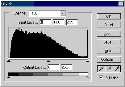 The first is the Levels dialogue box (left). This breaks down the pixels
in terms of light and dark and displays them in terms of a histogram.
By moving the arrows for the Input Levels and Output Levels, you can
adjust the brightness and contrast of the image with fine precision.
The first is the Levels dialogue box (left). This breaks down the pixels
in terms of light and dark and displays them in terms of a histogram.
By moving the arrows for the Input Levels and Output Levels, you can
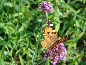
adjust the brightness and contrast of the image with fine precision.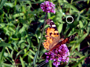 The eyedroppers in the lower right of the dialogue box allow you to set
values for the darkest tones, lightest tones, and midtones by clicking
on the appropriate eyedropper and then sampling an image pixel. For
example, clicking on a dark green pixel where indicated by the white
circle (right) sets that as the darkest color in the image, thereby
darkening the image overall. Compare this darkened image with the
version above.
The eyedroppers in the lower right of the dialogue box allow you to set
values for the darkest tones, lightest tones, and midtones by clicking
on the appropriate eyedropper and then sampling an image pixel. For
example, clicking on a dark green pixel where indicated by the white
circle (right) sets that as the darkest color in the image, thereby
darkening the image overall. Compare this darkened image with the
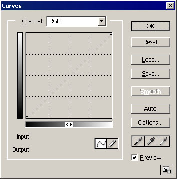
version above.The Curves dialogue box is another tool for adjusting the image. What this does is set up a curve showing the relationship between the lightness/darkness of the input pixels and the output pixels. You can change the shape of this curve to brighten or darken the pixels at any value you choose. The pictures below illustrate what happens when you click on the curve to create anchor points and move the anchor points around.
 |
 |
 |
 |
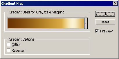
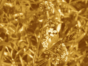 Finally, a handy item on the Adjustments menu is Gradient Map. This
function maps the pixels to a gradient of your choice based on their
brightness. A simple black-to-white gradient will produce a grayscale
image. Choosing a gradient with different colors can produce interesting
effects.
Finally, a handy item on the Adjustments menu is Gradient Map. This
function maps the pixels to a gradient of your choice based on their
brightness. A simple black-to-white gradient will produce a grayscale
image. Choosing a gradient with different colors can produce interesting
effects.I mapped the butterfly picture to a custom gradient (left) to obtain the result shown (right).
Where this function really comes in handy is when you are designing textures and patterns. You can use filters on a simple grayscale image and then map the image to a color gradient to colorize it. This can produce textures such as fur, wood grain, fire, stone, and other designs that you may wish to use in your images. An example of this is given below.
Step 1: Open a blank white image and use a combination of filters to make the desired texture. I used the combination Add Noise (100%, Uniform, Monochromatic), Motion Blur (0°, 15px), Unsharp Mask (250%, 50px, 0), and Ocean Ripple (3, 1) to create a grayscale image of waves.
Step 2: Select a gradient to apply to the image. There wasn't a preset gradient that I liked, so I created the custom gradient shown and saved it to the gradient menu.
Step 3: Use Image → Adjustments → Gradient Map to apply the gradient to the image.
Step 1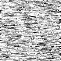 |
Step 2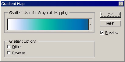 |
Step 3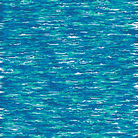 |
6. Having fun with text
Adding text to your image to make captions is already fun, of course. Choosing a font, warping the text, using masks and styles and other techniques to decorate the caption--all of it contributes to the enjoyment. One more thing you can do with text, however, is to use each letter (not just the dingbats) as an artistic element to be manipulated. For example, you can use filters to distort the text into unusual shapes. You can also rotate the text into unexpected angles, or copy it to make patterns. The process below illustrates these possibilities. Font: Hancock |
 Filter: Distort: Twirl (200dg) |
 Gradient Overlay (yellow/pink/purple, radial, 125%) |
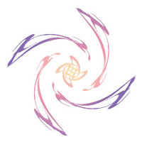 Copy (×3) and rotate (90°CW, 180°, 90°CCW) |
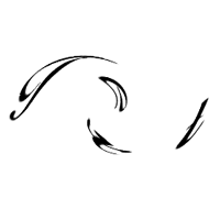
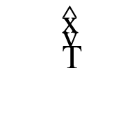 Font: Times New Roman (^ x v T) |
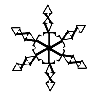 Copy (×5) and rotate (60° increments) |
 Define brush (Size Jitter: 100%, Scatter: 180%) |
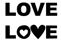 Finally, another thing you can do with text is to change the shapes of
individual letters to suit the theme of your caption. Right-click on the
text layer with the Type tool, then use the pop-up menu to convert the
selection into a path. Manipulate the resulting path as you would any
other shape. When finished, fill the path with the desired color. The
picture on the left shows how the word "love" (written with the font
Arial Black) was changed to add hearts.
Finally, another thing you can do with text is to change the shapes of
individual letters to suit the theme of your caption. Right-click on the
text layer with the Type tool, then use the pop-up menu to convert the
selection into a path. Manipulate the resulting path as you would any
other shape. When finished, fill the path with the desired color. The
picture on the left shows how the word "love" (written with the font
Arial Black) was changed to add hearts.If you don't feel confident manipulating the paths of the letters directly, you can always combine them with paths drawn using the Shape tool.


0 comments:
Post a Comment